Statement Of Intent:
For my portfolio, I intend to produce a wide range of photos based around nature and shadows. The theme I chose was light and dark, which will go on for a couple months. The reason I chose this theme is because it appeals to me and is entrancing to me, and doing nature and shadows helps me capture different elements of the world around me. Our first trip will be into Manchester in a couple weeks to help with this and capture the different looks and aesthetics in Manchester and help capture different forms of nature and shadows. In the city centre I will be able to fully immerse myself in the buildings and the shadows casted, using my fellow peers to also cast shadows and be models. I can also capture some of the nature and architecture like the old buildings but also the modern ones and edit it.
For my research I plan to look into a couple different photographers with similar styles to what I want to do, and photographers who are able to capture the things that I also want to. There are many such photographers such as Ansel Adams or Ferdinando Scianna. Both capture nature as well as people. Their photos intrigue me as they are able to capture the entire essence of a place, whether in an old town or a national park, even their ways of capturing the different elements of nature in the scene, and in turn making aesthetic looking photos. Another photographer that achieves the same standard I would say is Fan Ho, similarly to Scianna he photographs parts of the old town, with simple yet effective photos, using people or natural light or angles to his advantage to result in aesthetically pleasing images.
Techniques I would like to use on Photoshop are things like, playing around with colours, turning photos black and white, or the saturation and brightness. I would, with a camera, like to get a lot of landscape shots and perhaps changing my F-stop or ISO to make the photo look darker, or use zoom to get really close in on objects or zoom out to get a wider frame of things this can result in photos that capture a whole scene in nice lighting. I hope to learn more about nature and the effect of colour, and see the world through different lenses, quite literally. Through using colour and styles of photography to capture the different atmospheres of a scene. I see my final format as being able to capture nature and the world around me through colour to give different effects, and using Photoshop to amplify such effects to create aesthetically pleasing photographs, such as desaturating photos or playing around with colour settings to create nice areas of colour within a photo that can put across different emotions.
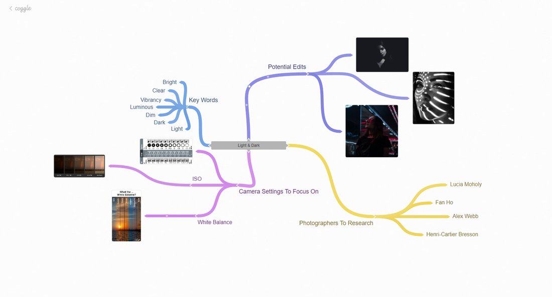
Coggle
Analysis 1:
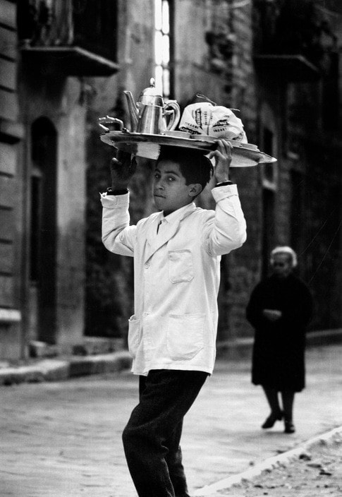
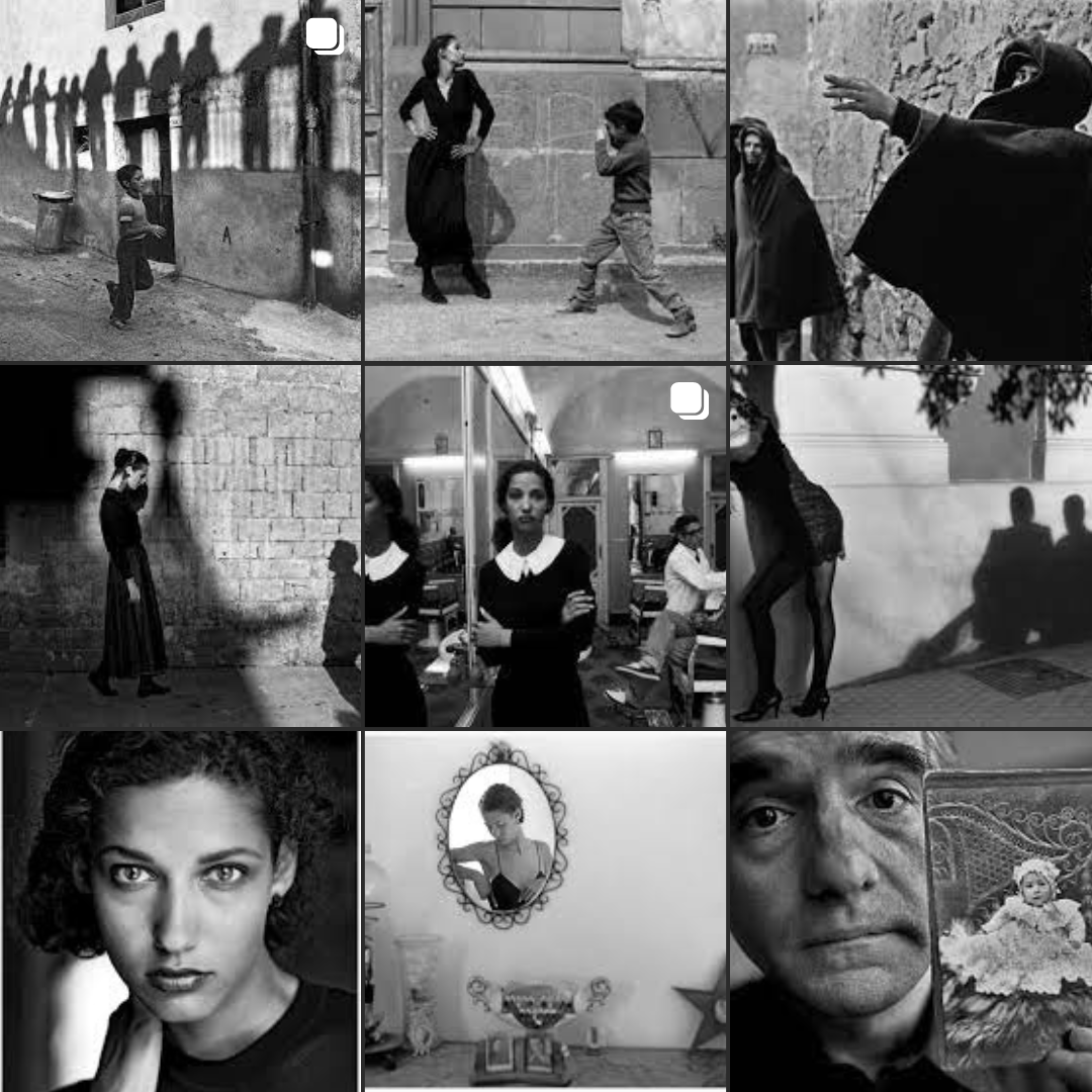
The theme I have chosen is “Light and Dark”, the photographer I have chosen to go with this theme is Ferdinando Scianna.
Context:
The image above was taken by photographer Ferdinando Scianna. This image was taken in Sicily and depicts a barman, who is a young boy as it seems, serving breakfast taken in 1964. Scianna was born on July 4th 1943, he started to take pictures in the 1960s while studying literature, art history and philosophy, at the University of Palermo. Scianna spent the first 22 years of his life in Sicily and over those years became a specialist in the “Sicilian way of life” as well as spending many more years documenting the culture around it. This image represents that and is his documentation of Sicily.
Content:
This image is a portrait image. It shows a barman and a woman in the background, this image may represent the culture of Sicily and barmen and food or cuisine. This photo is one of many in a series titled “Les Siciliens” translation to the Sicilians, for some this may change the meaning of the image and be all about the Sicilians and their way of life as we know that that's something Scianna looked into, studied and documented. In the image the tone contrast of the white clothing of a barman to the darker buildings in the back and the darker clothes of the woman in the back. The effect of this can be to show the darker mood tones, and his contrast against them, to help him stand out. The tray also stands out, and the content seems to be a teapot and possibly food wrapped up. This image is also very realistic as it's something that happens and isn't so over the top or anything, the theme of this work is Sicilian culture. In the photo I can see a tray that he is holding, he is a barman at a young age, and the old lady in the background helps contrast that, she's dressed in all black whereas he's primarily all white, the use of black and white contrast helps to outline things like the boy, but makes things in black a little less noticed. The photo was taken in an alley way or street, with the boy looking as if he was caught of guard in the photo. This helps gives the effect of the natural photo as if it might have not been planned or anything.
Composition:
In this image I think the rule of thirds has been used and the man is more in the middle with the lady being more on the right hand side. With depth of field used, the man is the main focus and is looking directly into the camera, also in the foreground and the woman in the background as well as buildings too. I also think rule of thirds has been used, as the man is more in the middle of the vertical column and one could talk about how the tray and stair could be splitting the image up further, the woman is also present in the right vertical column and this helps the viewers eye be attracted to him and look at him and makes anything else sort of be blurred. The use of central focal point helps him stand out, even the fact he is in white helps attract the viewer to him. In this image I do think a tripod was used, for stability and preciseness. In my opinion I also think the white balance was set to about 5200K sunlight setting, and the ISO at maybe 1600, Aperture at F32, and shutter speed 1/1000, I think a standard camera lense was used. The image has an outdoor setting near a bar, and I think the lighting used was sunlight. The main focus was in the foreground. I think he got the black and white effect due to the result of people not having the ability to print colour. Him using these compositional rules helps with a framed photo using rule of thirds, which results in a visually appeasing photo. The sunlight also shines down and goes directly on the boy, this helps highlight his clothing and makes it brighter.
Connection:
I like their use of colour and the theme of light and dark, I would say his ability of capturing light and dark and I wouldn't say he has many weaknesses in his photo. He captures the basic lives of ordinary people doing day to day activities. His work links to mine as I want to do light and dark themes my work in the future. I could use the idea of natural photos with people just leading ordinary lives rather than anything extreme.
Analysis 2:
Context:
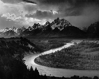
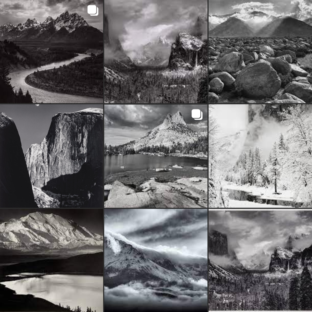
The photo above was taken by photographer Ansel Adams, it was taken at Yosemite National Park in 1927, Adams had first visited Yosemite and claims that's when he “fell in love”, the photo was taken in a black and white landscape shot. Adams was born in Feb 1902, in San Francisco, California. He died in Apr 1984, being born in California near the national park, and visiting it made Adams feel like a new era began for him, and started to photograph things before becoming a photographer.
Content:
The photo displays the National Park of Yosemite in California, and is a black and white shot of the park, showing trees, a river and mountains. It is a landscape photo that may represent sadness or melancholia, and the white of the picture may represent hope and purity. The tone contrast between black and white like the dark mountains with the snowy tops and the white clouds, or the river and forest, the contrast between the black and white can emphasis the removal of colour in the photo which can remove the distraction of colour and can help people to focus on other parts of the image, it also brings darker mood tones, and more melancholic, sadder tones. These tones can help make the viewer feel the atmosphere and the darker tones, possibly even making the viewer feel sad due to the sulky nature of the shot. Another prominent feature of the image is the textures within the scene, such as the water, or snow, or trees, or even the clouds, this could possible lead into the touch aspect of the landscape and sense of being, making the viewer feel as though they're in the image. Also it shows clouds above the mountains, hinting possibly of a storm and the feeling that comes with it. The photo is a realistic photo as it's of a real place and hasn't been distorted, I think the theme this work also represents is melancholy and gloominess and with the clouds. The mountains also have leading lines and helps the viewer follow along, the photograph is called "The Tetons and Snake River", after the mountains called Tetons and the Snake River that leads up to it, the photograph was critically acclaimed by many and named one of Adams' best.
Composition:
In the photo, the rule of thirds isn’t used, however I think leading lines have been used to draw our attention, the river slowly curves its way up this may have been used to attract our gaze to the mountains where more leading lines appear for the mountain range. This helps to draw our eyes along the mountain line, which leads further into the sky and the clouds, this gives the image multiple focus points. And depth of field, in the foreground trees and the river can be seen, going into the middle ground with also plains and in the far background, mountains. I think this was done to capture the whole picture and setting using a large depth of field. In the photo I think a tripod has been used for that more accurate shot, I think F32 as it captures the background really well. I think a low ISO has been used of maybe 100, and shutter speed 1/1000, as it's a really clear shot. A white balance of natural or shady but I think it may have been edited in photoshop. I think a wide angle lense was used to capture the full background. An outdoor setting would have also been used and natural light, but edited later on to make it black and white, the image also mainly focuses on the mountains in the background and the river in the foreground.
Connection:
I like the way he shot the landscape and the black and white tones of the photo, I would also say the way its been done is a strength and I wouldn't say there's a weakness to it, their work links to mine as its black and white and in the future I could also use the style of landscape too, the skills I could focus on are taking the photo in a such manner, using the same sort of style, I could also use leading lines in a similar way to draw the attention of the audience.
Analysis 3:
Context:
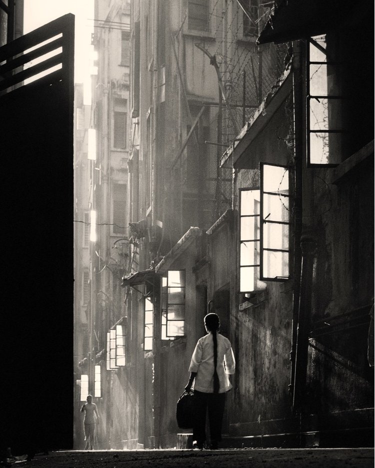
This photo was taken in 1960, and taken in the “Back Lane” in China. It was taken by Fan Ho. It was made and depicts the streets of Hong Kong, in the 50s and 60s. It was put up in an Exhibit recently. Fan Ho, a Chinese Photographer who was born in Shanghai in 1931, his photos display a fascination with urban life, alleys, slums and markets as well as streets. A lot of his work consists of candid photographs of street vendors and children only a few years younger than himself. The work itself doesn’t relate much to a social or political history and in Fan Ho’s own words “I didn't work with any sense of purpose. As an artist, I was only looking to express myself. I did it to share my feelings with the audience.” Some of his other works depict soldiers or the general public and working class, just going about their life.
Content:
The photo displays a woman who is walking through the streets, holding a bag. It’s a portrait of the woman, and I think it represents the stark emotions of mankind’s working class and exemplifies the solemn features of nature and the contrast between the light and dark, this helps make the reader possibly feel sad and stark emotions. I think it also may represent life in a quiet community, and in the ordinary life of someone. The title is “Back Lane” and I think it only adds more to it, and gives the viewer an insight to the location of where it's taken. The photo seems realistic as it’s something I could take and something that happens on a day to day, it wasn’t over exaggerated. The theme of the work seems to be humans in a day to day life. The use of lighting was extremely well done, and the gradient of light coming down the lane illuminating it. Also the lines on the buildings and the window and how they go down to the left and also the contrast between the light and dark has its effect and shows how the work possibly represents loneliness, the woman is alone and seems to walk out the dark into the light from the shadows. This helps add to the possible message of perseverance and the light of life.
Composition:
Rules used are rule of thirds, you can see the streak down the middle of light, the woman in the bottom middle, the effect this creates is drawing attention to different parts of the picture, and having the woman as the central focal point. I would also say leading lines are used, with the streaks of light, this helps draw the viewers at tension across the screen towards the woman, but also the windows and how they're arranged. There is depth of field in the photo as it was taken from the left side as you can see the window shutter on the left side. The girl is in the middle ground, the light is in the background which helps captivate the viewer. I think this image was taken using a tripod as it’s very balanced, and it helps gives the image a stable look. I think the white balance was set to shady/cloudy, as the image was taken in the shade or sunlight due to the streak of light. I think the ISO was set to 800 to give a good light look or even 400, I think the f-stop was set to perhaps F22 to give a nice shot and a clear one. The shutter speed to 1/1000 as it’s very quick which results in a clearer photo. In the photo, worms eye view is also been used. This can help make the image feel bigger then it is, this helps show depth and could possibly add to the gradient of light in the image. Through this depth it also sheds more light on the scene, and the angle used as though the camera is lurking to the side and in the bottom left corner of the scene.
Connection:
The thing l like about the work is the way it's shot, and the use of light and dark in the image. I would also say this is a strength about his work. I would say his work somehow always perfectly captures the different vibes of different feelings and emotions, such as loneliness and a deep stark feelings of emptiness. Even another thing to note is how the woman is small and takes up a small space in the image as a whole. Their work links to mine through colour, and through the way he captures shadows, people and buildings. Skills I need to focus on could be rule of thirds and framing within light and dark. To make my work more like theirs I can focus on using rule of thirds and play around with lighting and how it illuminates the background and also direction of the light, to achieve something similar.
Plan for shoot 1:
Name:
Shahbaaz Aziz
Project Title/ shoot number:
Light and Dark, Shoot 1
Description of aims for shoot:
My aims for this shoot is to capture images of contrasting colors and light and dark/black and white, Shadows.
Links with Photographers: Ansel Adams
Location: Stretford High School
Props/ items needed: Random items
Kit needed e.g. lighting, tripod, backdrop, macro lens: Nothing
Camera settings I will use:
F-Stop: F32
White Balance: Daylight
Shutter speed: 1/1000
ISO: 400
Which compositional rules will I use? (Rule of Thirds, even numbers, odd numbers, symmetry, asymmetry, leading lines, patterns, repetition, triangles, birds eye view, worms eye view, central focal point):
Try to use rule of thirds, Symmetry, Leading lines, Birds eye view.
Plan for shoot 2:
Name:
Shahbaaz Aziz
Project Title/ shoot number:
Light and Dark, Shoot 2
Description of aims for shoot:
My aims for this shoot is to capture images of different forms of architecture and nature.
Links with Photographers: Ansel Adams
Location: Stretford High School
Props/ items needed: Random items
Kit needed e.g. lighting, tripod, backdrop, macro lens: Nothing
Camera settings I will use:
F-Stop: F32
White Balance: Daylight
Shutter speed: 1/1000
ISO: 400
Which compositional rules will I use? (Rule of Thirds, even numbers, odd numbers, symmetry, asymmetry, leading lines, patterns, repetition, triangles, birds eye view, worms eye view, central focal point):
Try to use rule of thirds, Symmetry, Leading lines, Birds eye view.
Mood Board:
|
|
Photos of Hamza:


Shadows:


Glass Orb on Floor:


Glass Orb in Hand:


Glass Orb in Fence:


Little people:


Best..: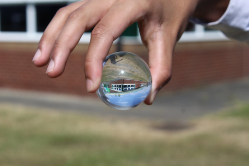
This is my best photo because it perfectly captures different elements that can be perfect for edits and making them black and white, and the orb captures the reflection in a different frame with it in focus and the back ground as out of focus, with a good white balance set to sunny and ISO to 800, this helps with lighting and the photo not being completely dark but light enough to make it clear. Also my shutter speed was set to around 1/1000 so the photo was clear and in focus. I had a lower F stop so the foreground was clear and backdrop was out of focus.
|
Worst..: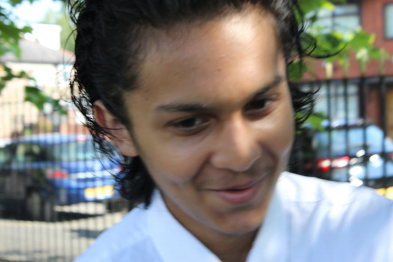
This is my worst photo because it doesn't capture the model in good lighting or good frame, the image is out of focus, and extremely out of focus, even the models expression isn't good, he isn't focused on the camera and overall the image was poorly taken. the image had good lighting but due to the model it got blurry but settings were similar just the model and him being out of focus. My shutter speed was set to around 1/1000 so the photo was clear and in focus, not only this but white balance to sunny and ISO at 800 to help with lighting.
|
Snippets for Edits:


Edits:


Combination Edit -
Original photos:


Snips for Edits:


Final Photo:
Plan for shoot 3:
Name:
Shahbaaz Aziz
Project Title/ shoot number:
Light and Dark, Shoot 3
Description of aims for shoot:
My aims for this shoot is to capture images of different forms of architecture and nature, by capturing people/shadows and buildings.
Links with Photographers: Ferdinando Scianna, Ansel Adams and Fan Ho.
Location: Manchester City Centre
Props/ items needed: Objects and random items
Kit needed e.g. lighting, tripod, backdrop, macro lens: Possibly light reflectors
Camera settings I will use:
F-Stop: F1-F22
White Balance: Shady/Cloudy
Shutter speed: 1/1000
ISO: 100-800
Which compositional rules will I use? (Rule of Thirds, even numbers, odd numbers, symmetry, asymmetry, leading lines, patterns, repetition, triangles, birds eye view, worms eye view, central focal point):
Try to use Rule of thirds, Symmetry, Leading lines, Birds eye view.
Mood Board:
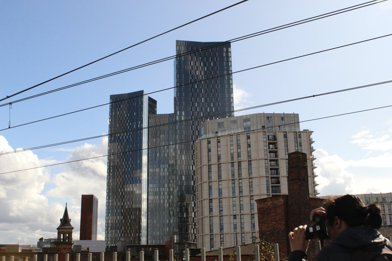
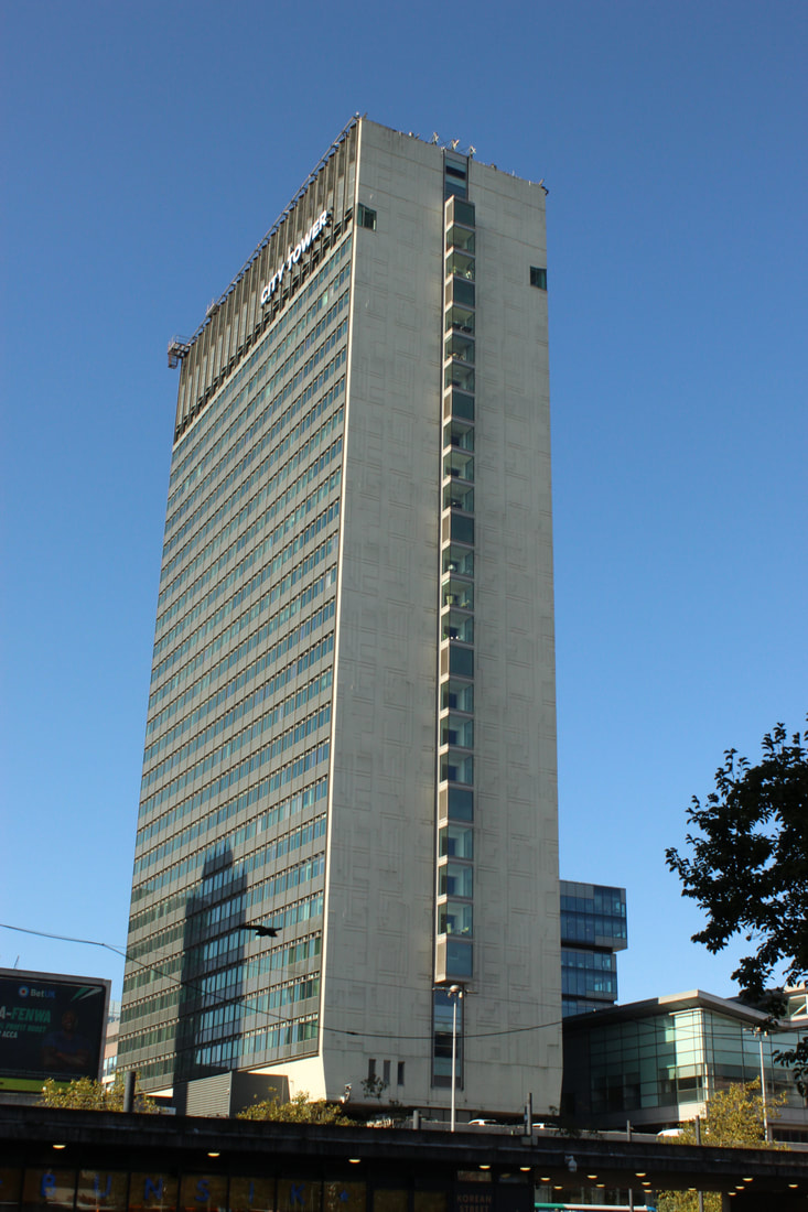
Manchester Photoshoot:
Manchester Lancashire Cricket Ground -


Shadows -


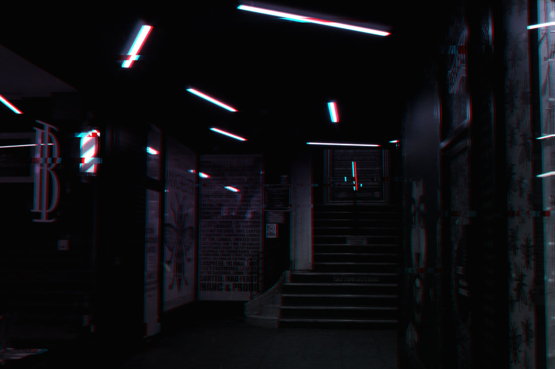
Circle Lighting in a Passageway -


Reflection Shots -


More Shadow Shots -


Best: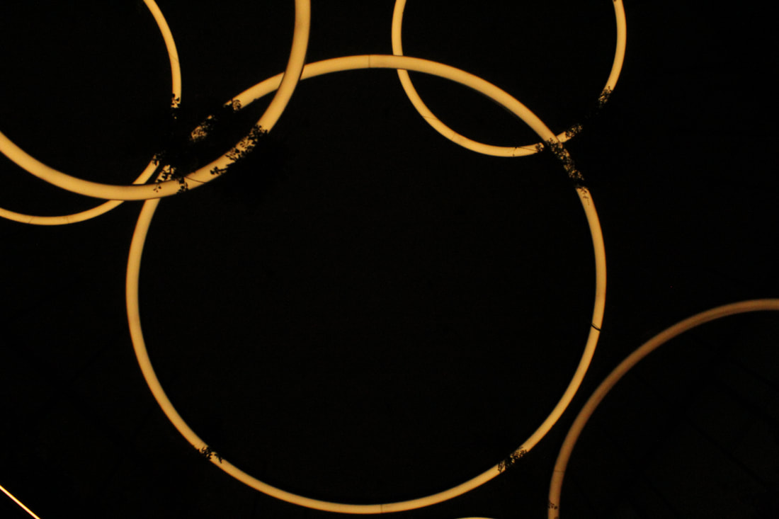
This is my best image because, although it is dark, it's eerie with only the circle as light, my ISO was low at around 100, this helped result in the dark photo, my F-stop at around F22 to give the image a clear photo and shutter speed at 1/1000, this resulted in a clear and crisp image. My white balance was set to shadow as I was in a shadowed place, this helped with making the lighting come out well.
|
Worst:
This is my worst image because, although the camera settings were good with ISO at 800, white balance on auto, F-stop at F22 and shutter speed at 1/1000, things in the image like the leaves, or the grass, and the overall framing of it, makes the image not look as good.
|
Affleck Palace -


Best:
This is my best image because the location is in a nice shaded light and how my ISO was at 400, this helped result in a nice dark photo, my F-stop at around F22 to give the image a clear photo and shutter speed at 1/1000, this resulted in a clear and crisp image. The image includes leading lines, by the railing going up the stairs.
|
Worst:
This is my worst image because my ISO was high at around 1600, this resulted in a very highly bright photo, my F-stop at around F20 to give the image a clear photo, and shutter speed at 1/1000, this would've resulted in a clear and crisp image. But due to poor camera skills and my movement, came out horrible and resulted in a super out of focus picture.
|
Shadow/Fountain Shots in Gardens -


Cathedral Shots from the Outside -


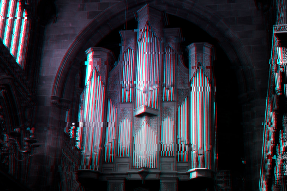
Cathedral Inside -


Sunflower Shots -


Shadows Outside Cathedral -


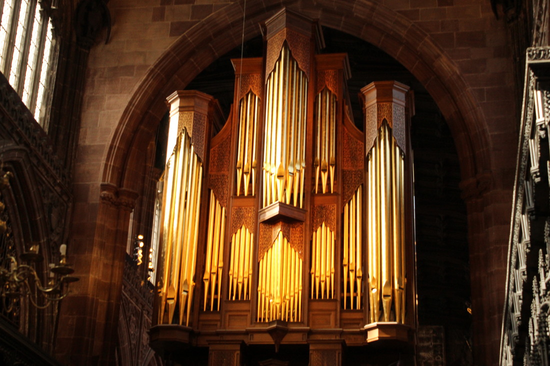
Best:
This is my best photo because it perfectly captures the organs and pillars with little details and lighting. The ISO was perfect at around 800 and the white balance I think was set to auto. This allowed for a perfect light to shine on the organs and pillars and capture the little details and colours. The shutter speed was at around 1/1000, allowing for a clear crisp photo. The F-stop was at F22, giving the background a nice light and in focus. I also used the arches of the pillars to frame other features in the background like the window and organs.
|
Worst: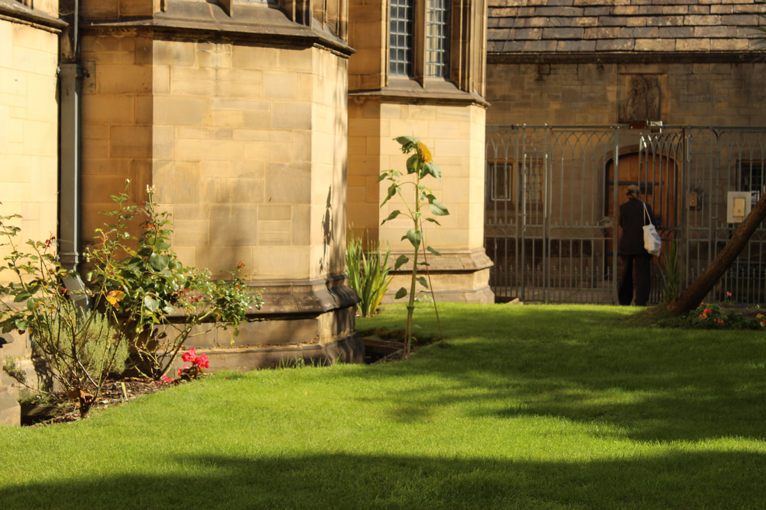
This is my worst photo because as you can see, there is a woman in shot, not only this but the framing is off, because the camera doesn't exactly focus on things like shadows and lighting, it includes them but there are multiple aspects that throw you off. The ISO was around 800 and the white balance on daylight, this helped show of features of the photo like light and shadows, but the content in the photo isn't well related. The F-stop was set to around F22 and the shutter speed 1/1000, this is good and helped the background be clear and the shot clear too.
|
Cathedral Shots -


Best:
This is my best photo because, at the time I was going for more of a darker shot and I would say I did it extremely well, the image came out darker and more Gothic, I used ISO at around 200/400, which gave the image a nice stark Gothic look, the white balance was also set to shaded, this also helped and as you can see in the photo it looks quite dark except the golden organs, and the light on the pillars that helps with the aesthetics. The shutter speed is also at 1/1000, this makes the image in focus which makes everything clearer and helps with making certain elements stand out. The F-stop is also at around F22, which also helped the photo stay clear and in focus and things in the background stay in focus.
|
Worst:
This is my worst photo because, you literally can't see much, you sort of see the colour on the glass and light on the pillars, but overall I think my ISO was set too low, that and the white balance which may have been on shaded or auto. The shutter speed and F-stop I don't think were off, I think the lighting was the main problem. As well as that, there are things you can see in the way like the monitor screen. This wasn't what I was going for and ended up being too dark for my liking.
|


Best: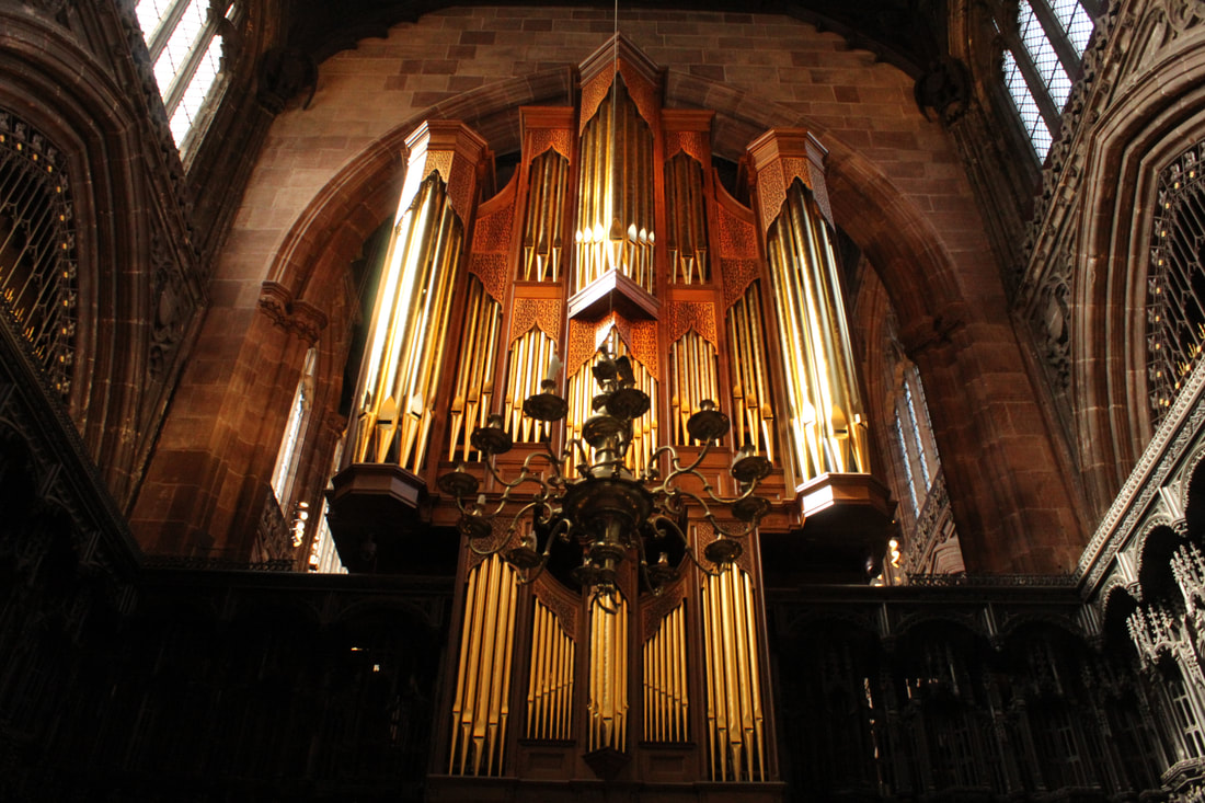
This is my best photo because, in my opinion the photo is well balanced, and the camera settings I used were, ISO set to around 800, white balance to shaded, this allowed for a perfect colour on the organs that makes them glow of sorts, and stops the photo being too over exposed, shutter speed to around 1/1000 this resulted in my photo being perfectly in focus and not out of focus, my F-stop at around F20, this helped everything in the photo be clear and represented. The photo was framed with symmetry and a worms eye view as I was just below it looking up.
|
Worst:
This is my worst photo because, the framing is very off, like how its not central and it was more just taken like that, in the photo you get a glimpse of a person and a information board, this isn't good as it draws the attention from the reader towards them. As well as this I think I could have done better on certain settings like perhaps turned up the ISO to make the image a little brighter and less dull.
|
Buildings Outside -


Cloud Shots -


Best:
This is my best photo because it's a simple yet effective photo and shows both light and dark aspects with the clouds, sun and sky. I achieved this by having my white balance on daylight and ISO at around 800, F-stop at around F22, and the shutter speed at 1/1000.
|
Worst:
This is my worst photo because even though their similar and how my white balance on daylight and ISO at around 800, F-stop at around F22, as well as the shutter speed at 1/1000, this image is completely obstructed by the building which just ruins it.
|
Puddle Reflection Shots -


Shadows at Castlefield -


Best: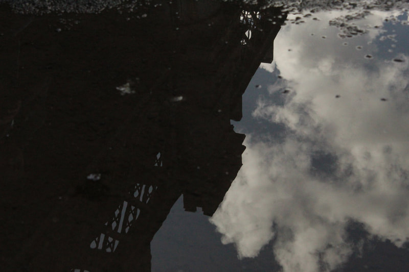
This is my best photo because, it reflects the viaduct and clouds, I used a shutter speed of 1/1000, ISO of 800, white balance of shaded and F-stop at F22. This all helps giving the photo a clear crisp image, and that's why I like it.
|
Worst: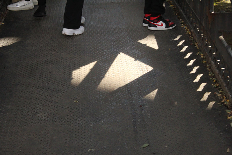
This is my worst photo because, although I used a shutter speed of 1/1000, ISO of 800, white balance of shaded and F-stop at F22. I tried to capture the shadows but people got in the way, resulting in a photo that isn't great.
|


Best: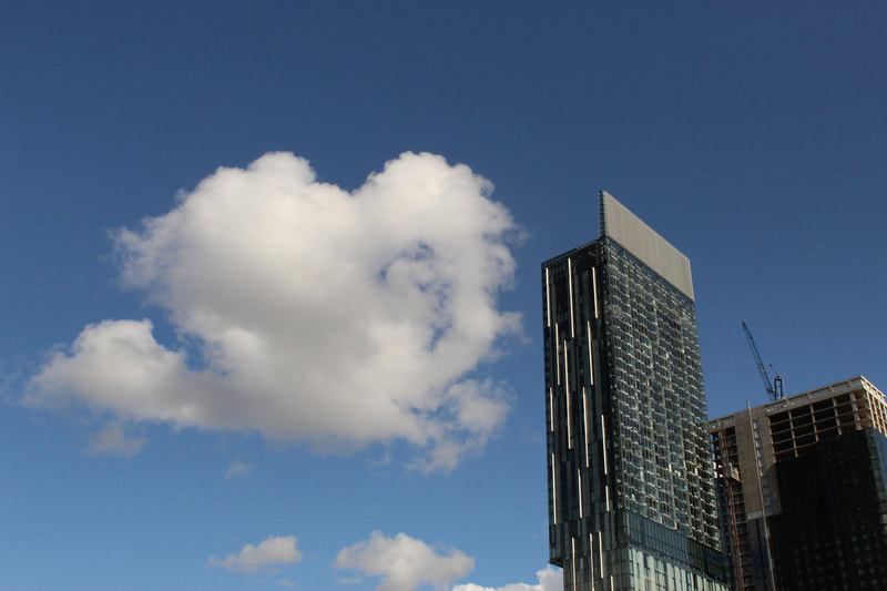
This is my best photo because, I used a shutter speed of 1/1000 for a nice clean photo, ISO of 800 to give perfect lighting, white balance of shaded and F-stop at F22, this helps give the photo a nice clean look with the sky and cloud, but I do think the crane/construction doesn't help and that would be something to improve.
|
Worst:
This is my worst photo because, in the photo you can see the tram lines, and one of my fellow students caught in the image, I also had my white balance on auto, my ISO on 800, shutter speed of 1/1000 and F-stop on F22, this resulted in a nice photo in terms of quality but not the context, I do also think the lighting is off by a little maybe because my white balance was on auto.
|
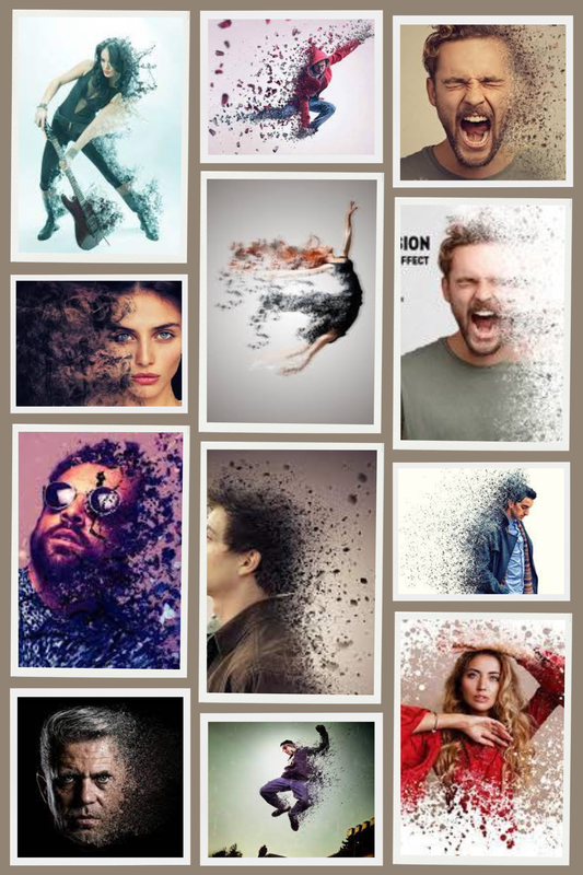
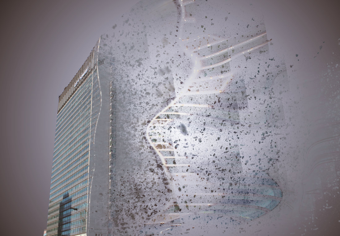
Dispersion Edit -
Moodboard For Dispersion Edit:
Original Photo:
Snips For Edit:


Building Dispersion Edit:
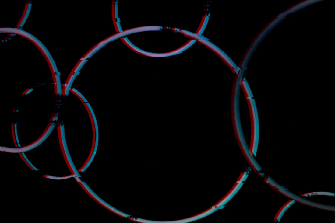
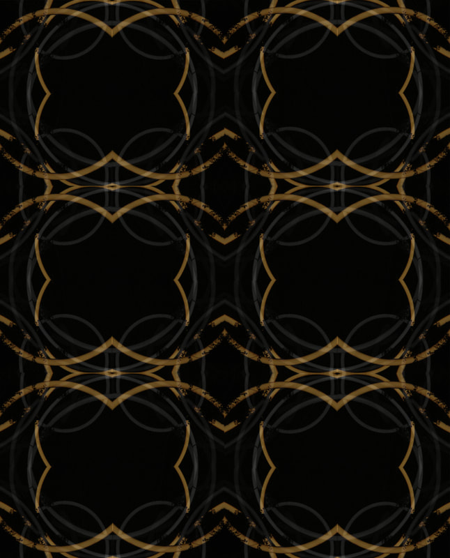
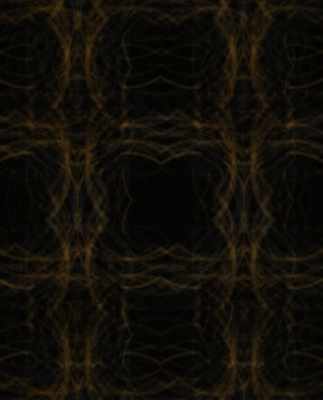
Kaleidoscope Edits -
Moodboard for Edit:
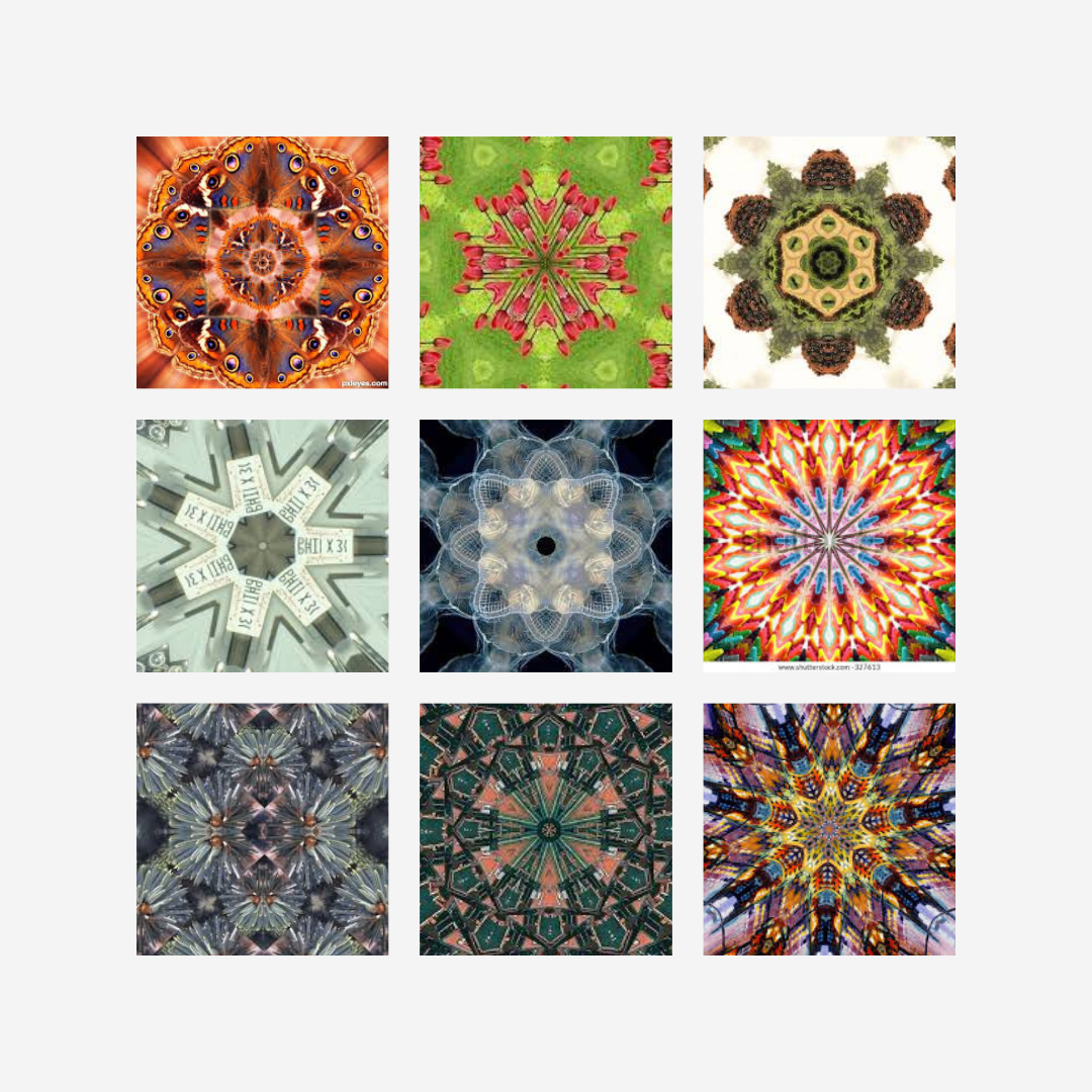
Original Photo:
Snips for Edit:


Edit (Colour):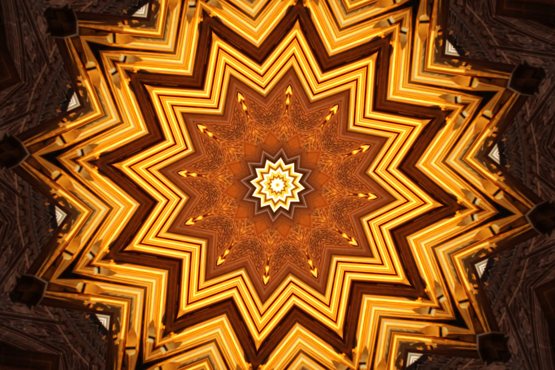
|
Edit (Black & White):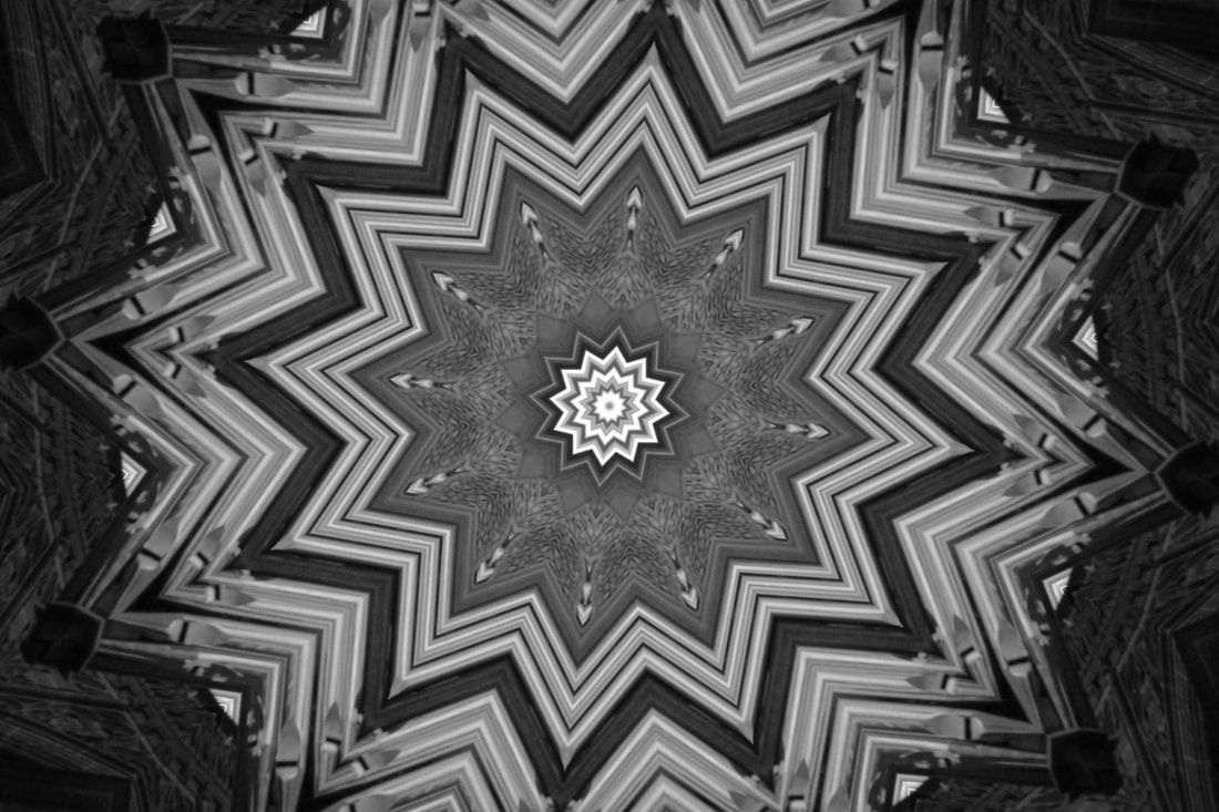
|
Snips for Combined Edit:


Edit (Version 1):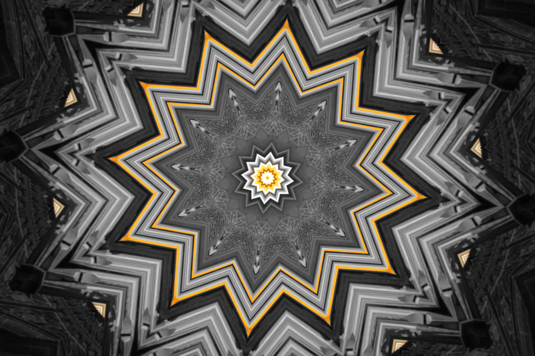
|
Edit (Version 2):
|
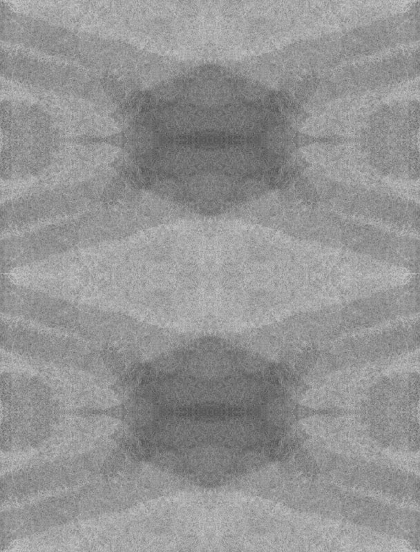
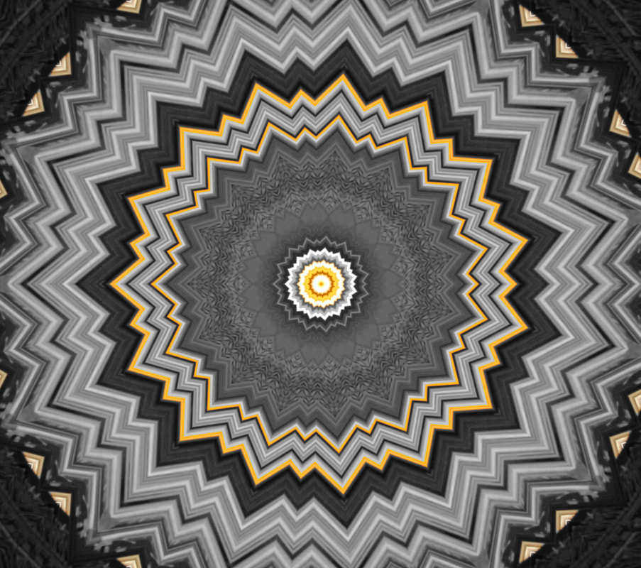
For this edit, I kaleidoscoped the original image and then turned it black and white, to further advance on it, I then overlayed the edits and cut sections out to create version 1, I then took the photo and went further by kaleidoscoping that image to create version 2.
Mock Exam -
Snips for Mock Edit 1:


Mock Edit 1:
Snips for Mock Edit 2:


Mock Edit 2:
Snips for Mock Edit 3:


Mock Edit 3:
Snips for Mock Edit 4:


Mock Edit 4:
Super Combined Edit:
Original -
Snips for Edits -


Original -
|
After -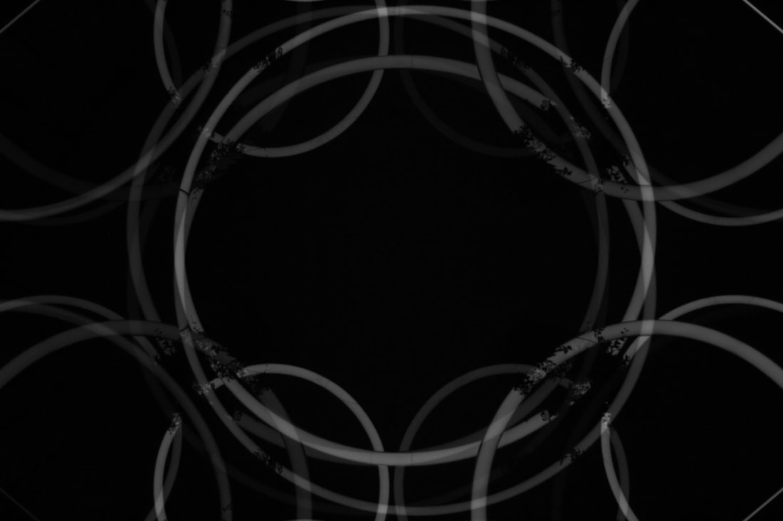
|
Snips for Edits -


Before -
|
After -
|
Snips for Edits -


After -
Snips for Edits -


After -
Justin Shoot (Light & Dark) -
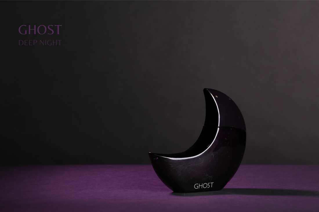
Ghost Bottle:


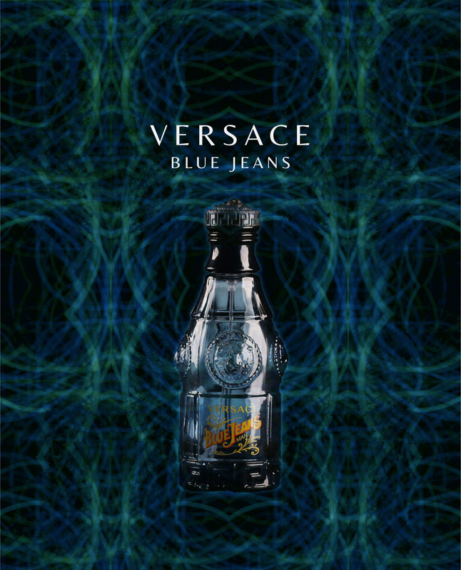
Versace (Blue Jeans) Bottle:


Best:
This is my best photo because the lighting is nice, the ISO was possibly 600, a shutter speed of 1/1000, an F-Stop of F22, and a white balance of shaded, as well as this, a tripod was used and more camera equipment to make it look nice.
|
Worst:
This is my worst photo because it was the first we took and we had issues with the lighting, the white balance was probably set to auto with a low ISO at 100 which makes the photo look dark, and also the diffusion lights didn't fire which also caused it to be dark.
|
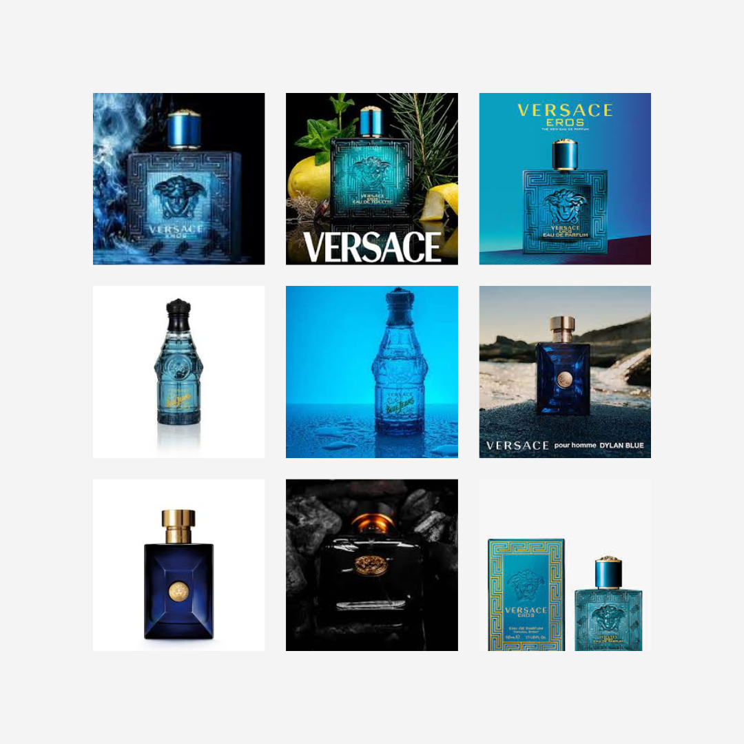
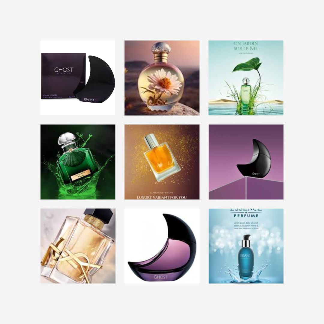
Perfume Advertisement Edits -
Moodboards:
|
|
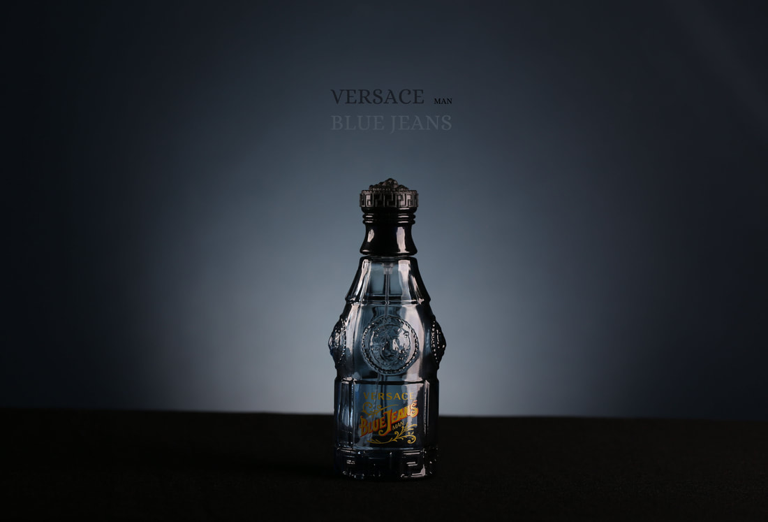
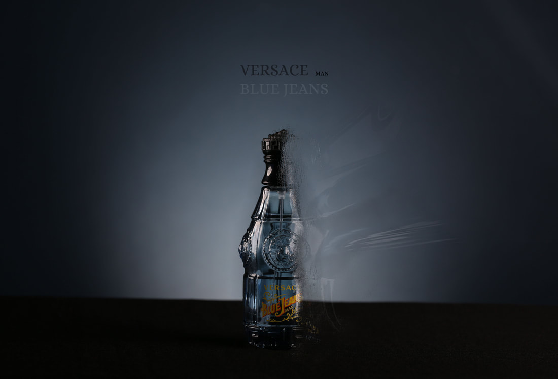
Touch Up Edit (Snips for Blue Jeans Bottle):


Before:
|
After: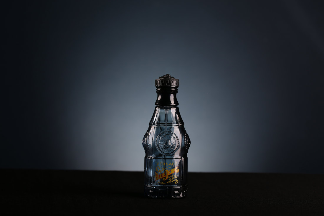
|
For this photo, we had to use a mirror to help reflect the lighting to the other side, but this meant that the outcome wouldn't have looked as good as the mirror was present, so to change this I used photo shop, I first opened one of the earlier images before this one without the mirror that also didn't have the lighting, I then masked it over it so I could get rid of the mirror and also keep the good lighting and reflection light on the left side of the bottle.
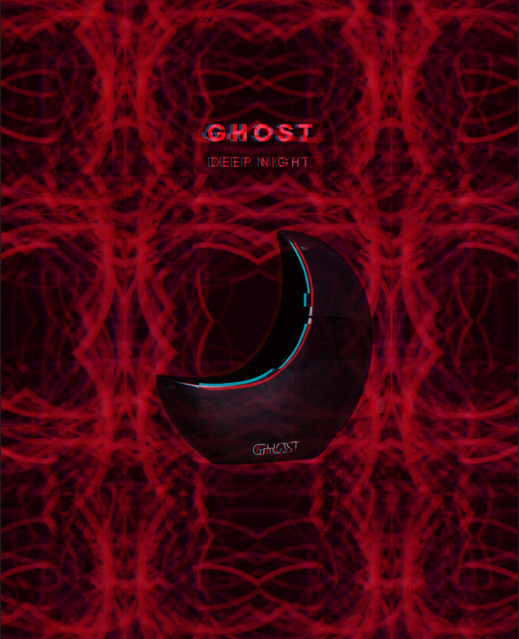
Touch Up Edit (Snips for Ghost Bottle):


Before:
|
After: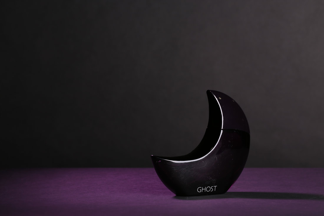
|
For this photo, I wanted to just have the crescent moon "ghost" bottle without the light on the top part, so to do this I did a similar step to the previous bottle and masked over an image from the beginning that didn't have the purple lighting but also didn't have the little light bit on it, I masked it over and then slowly went over it with my eraser tool using different brush sizes to slowly rub it out resulting in the outcome I got.
Snips for Edit 1:


Edit 1:
Snips for Edit 2:


Edit 2:
I was inspired by different works online and their links to light and dark and overall use of colour. So I came up with ideas and a mood board I was going to use for my edits, I wanted to make something that could catch a viewers eye to be attracted to it in hopes for them to "buy it". I would like to advance on this, improve this and take it further by making more interesting backdrops and use of colour.
Combined Edit (Kaleidoscope & Advert) -
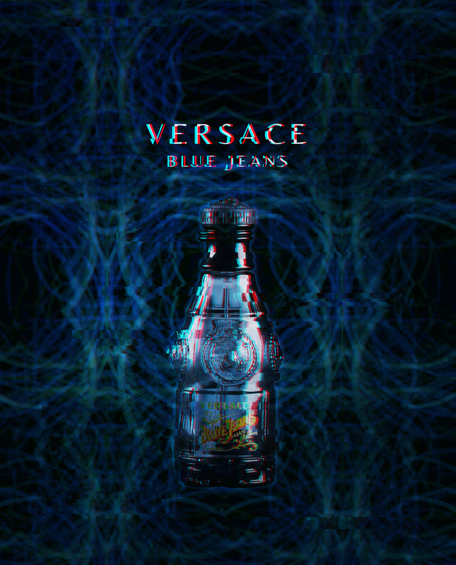
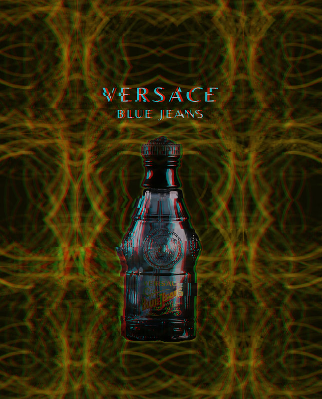
Snips for Versace "Blue Jeans" Bottle (Blue):


Versace "Blue Jeans" Bottle (Blue):
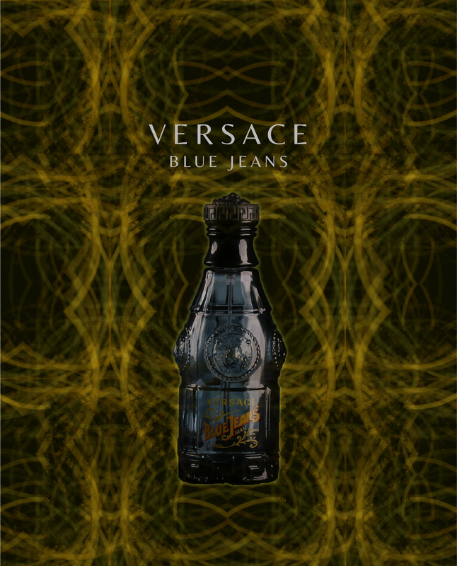
Snips for Versace "Blue Jeans" Bottle (Gold):


Versace "Blue Jeans" Bottle (Gold):
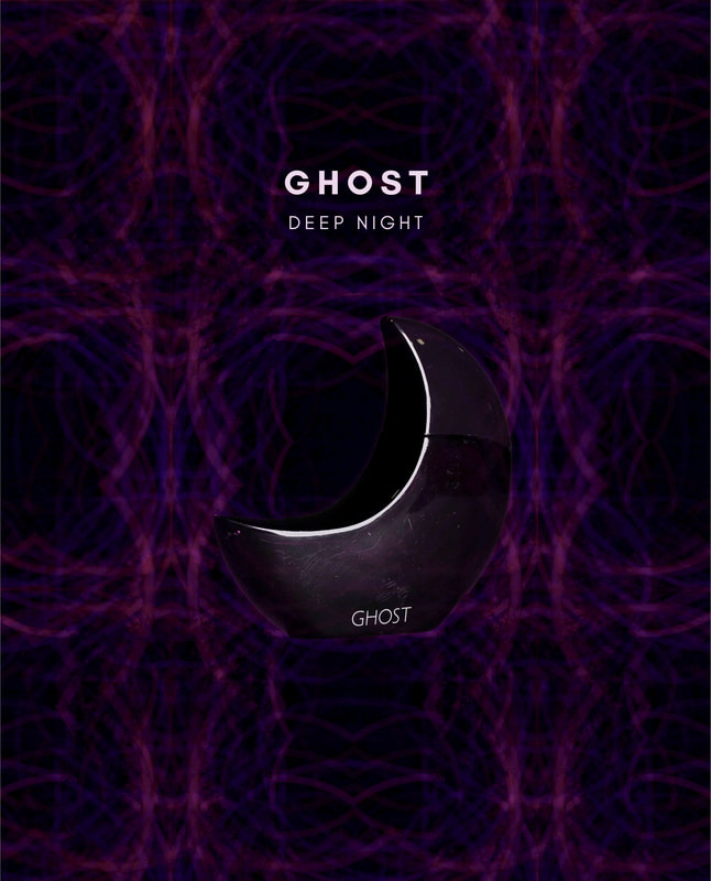
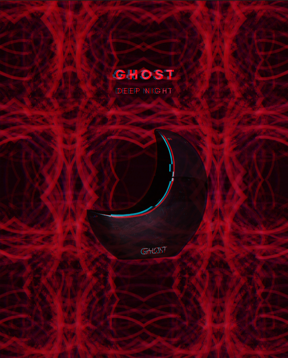
Snips for Ghost Bottle (Purple):


Ghost Bottle (Purple):
Snips for Ghost Bottle (Red):


Ghost Bottle (Red):
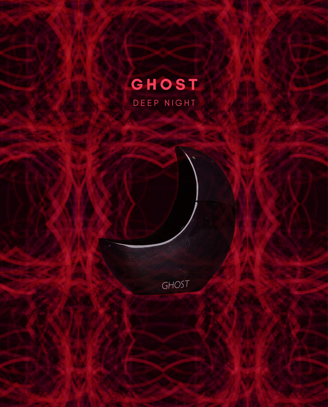
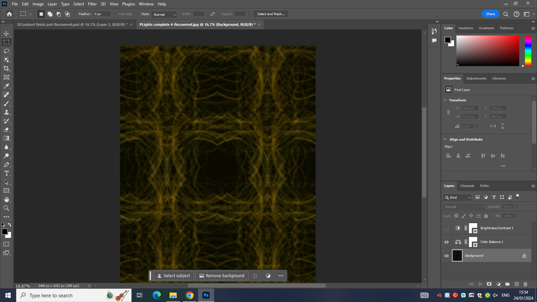
To make this edit, I had to use a previous kaleidoscope edit, I had made and change and modify the colour balance to give the backgrounds different looks and colours, then overlaying my perfume adverts over top to create a strange sort of illusion and have people drawn in through that and to help emphasise the actual perfume ad. I like how I was able to bring this across and successfully combine the two edits.
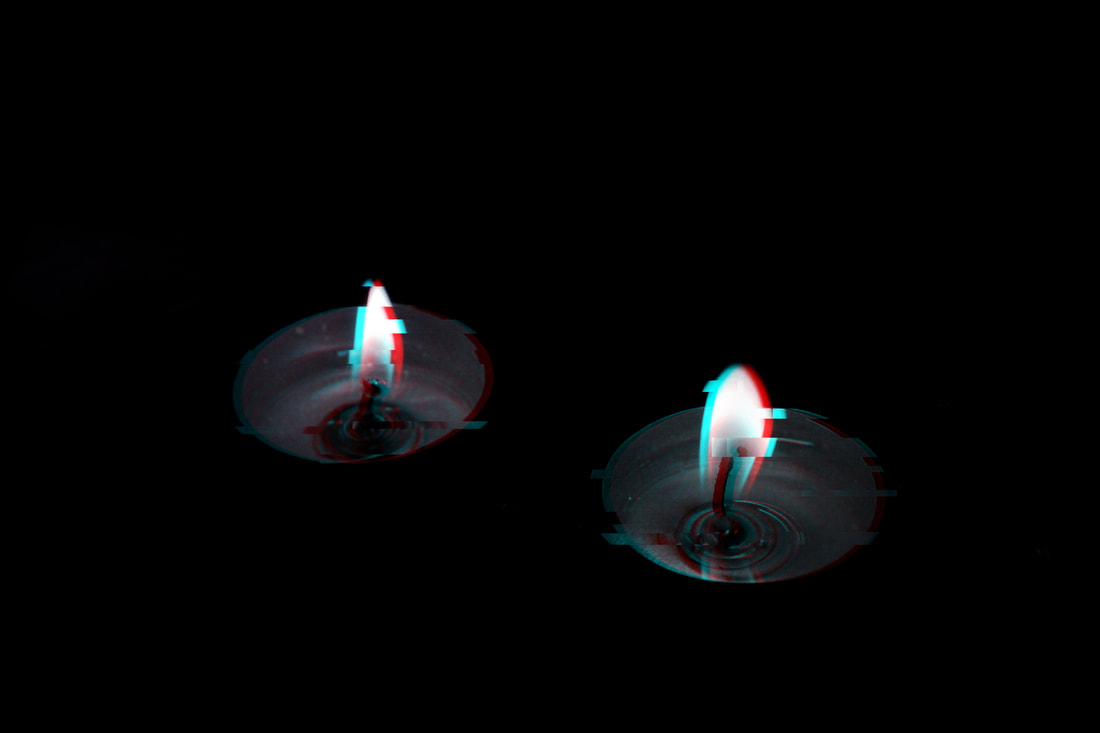
Glitch Combined Edit -
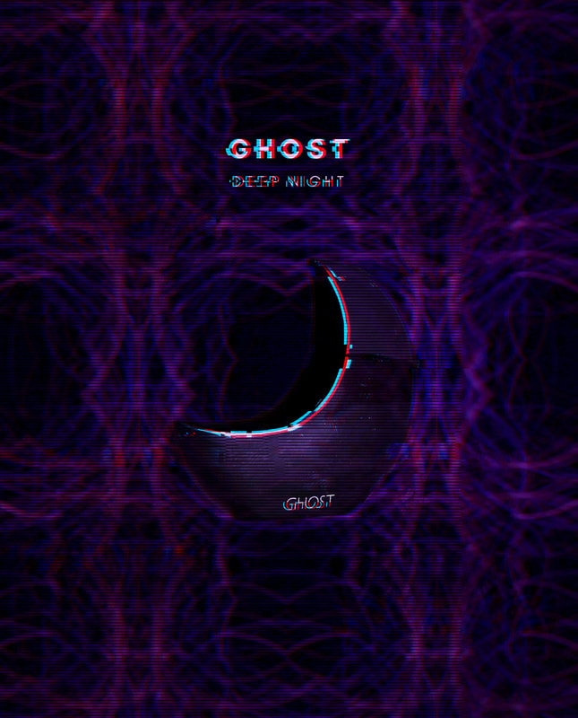
Snips for Edit 1:


Edit 1:
Snips for Edit 2:


Edit 2:
Snips for Edit 3:


Edit 3:
Snips for Edit 4:


Edit 4:
Dispersion Edit -
Original Photo:
Snips for Bottle Edit (Attempt 1):


Bottle Edit (Attempt 1):
Snips for Bottle Edit (Attempt 2):


Bottle Edit (Attempt 2):

In attempt 1, I messed up due to doing the wrong settings and so I went back over it and changed it and improved it, by further doing the liquify effects, and used different brushes to give it the different effects, not only that I took it further by adding different tints/effects to the image.
Final Gallery -
Tiling:

Kaleidoscope Edit:
Glitch Edits:
|
|
|
Perfume Glitch Edits:
|
|
|
Dispersion Edit:
Evaluation:
For my student choice I chose light and dark. I was really interested in this theme at first and it caught my attention because of the giant variation within it. It comes with the ability to vary in colour and brightness and tones. Even within it means that you can have variation in what you're capturing from buildings to people to objects. My ideas changed throughout it and as I developed my work I came up with new ways of capturing things and using different techniques and as well as going for a black and white approach to my work, I also did a lot in varying colours and especially within the edits. Ansel Adams and Scianna Ferdiando were two of the photographers I chose because of their use of black and white in light and dark, both had different approaches with Ferdinando going for more of a portrait style and people/life approach, by capturing life in Italy, and Adams going for more of a nature style, and capturing a lot of famous landmarks. I discovered both through use of the internet and them working with light and dark and being black and white. I’ve learnt that there can be more to capturing photos through light and dark by capturing different things such as objects and people in the midst of actions rather than direct photos similar to what was done in the first part of this project with photos done in school. Common themes I've addressed are lighting, colour and rule of thirds. I’ve addressed lighting and colour through edits and through general photos. Examples of this were the perfume bottles where we worked with lights and blue gel paper and different colour backdrops. With these photos I also worked with the rule of thirds and the position of objects in photos.
Experiments I've carried out are the photos I did with Justin, where it was very experimental and new to me, in this we used different styles of materials such as fabric on the desk for a black desk, or using a dark blue backdrop, even with the technique/process we had to put the light out of frame and shining on the backdrop to give it a sort of glow effect. We also used the gel paper to cover the lighting to make it blue so it had a direct connection to the object we were using and the backdrop and our vision of what we wanted and achieving that. A way I've refined and developed my work as like with the bottle and lighting on the bottles through doing touch up photos and minor edits like with the kaleidoscope photos, making minor changes so colours all blended well together and were harmonious. Along the way things changed as I went from a more black and white approach to doing more things in colour like with my kaleidoscope and perfume advertisements or glitch etc. where I worked with colour a lot more and as the main focus of some of the photos. I did this and further emphasise colour because I wanted it to link to the different seasons, and different emotion as that's something I wanted to focus on, with red representing warmth of autumn and the oranges, or blues relating to coldness of winter. A habit of mind I changed was meta cognition and focusing on moving forward and reflection to improve my work and even teamwork as at the start of the project in the early photos I worked with friends and peers in doing things like holding objects or modelling in the photos. I found being able to put things together the hardest as my work was all over the place and extremely unorganized to begin with, but worked through to achieve a good layout of all my work in a nice showcase and representation of my ability and improvements.
I’ve chosen to present my ideas through a range of different concepts, however at the start I didn’t really know what I wanted to do, such as doing the kaleidoscope edits and not really knowing how I wanted them to turn out but advancing them piecing different things together to end up with a finished result. These ideas consist of building up different edits, such as the kaleidoscope, then the adverts, then merging them to later add glitch for the finished pieces, I made 4 to allude to the different seasons and opposing aspects and views of the same image. And choosing to present my different ideas and concepts through this. I was hoping to create work that could represent light and dark through the use of colours and tones, and making edits. I would say this worked well as my final outcomes can show this. This also links to why I think I've successfully explored the theme, through not only my edits and final outcomes but on smaller side projects and shoots I've been able to explore the different key aspects within light and dark through colour, through black and white, through editing, and trying different combinations of different things to produce work that I would say can perfectly encapsulate the different areas of light and dark. As I said, when entering this project I entered with no clear direct thought or concept but only advanced on them and building them up through my exploration in the different areas to explore within light and dark, and echoing that through the work I've produced to create a final outcome that summarizes this project as a whole and finishes it up. If I had more time I would do more editing and more work on variations of pieces so changing background colors or doing more shoots and things like that to really add more to my work. Also to consider what a final outcome could look like and build it up from the start. The more personal aspect of my work is my love for abstract pieces of photography and the beauty that can be held within a perfume advertisement from the colors to the object and framing and combining these two key aspects was something really fun and yet unexpected and to still come out with something like I did, it was really enjoyable. I hope viewers will understand that, even if the work does not contain deep levels of understanding or context, but just the absurd nature of combining different things to create something more aesthetically pleasing. Furthermore, as it is a perfume ad, I'd hope the viewer would see it and be interested and drawn to it because of the background or glitch and be interested in the product.
